


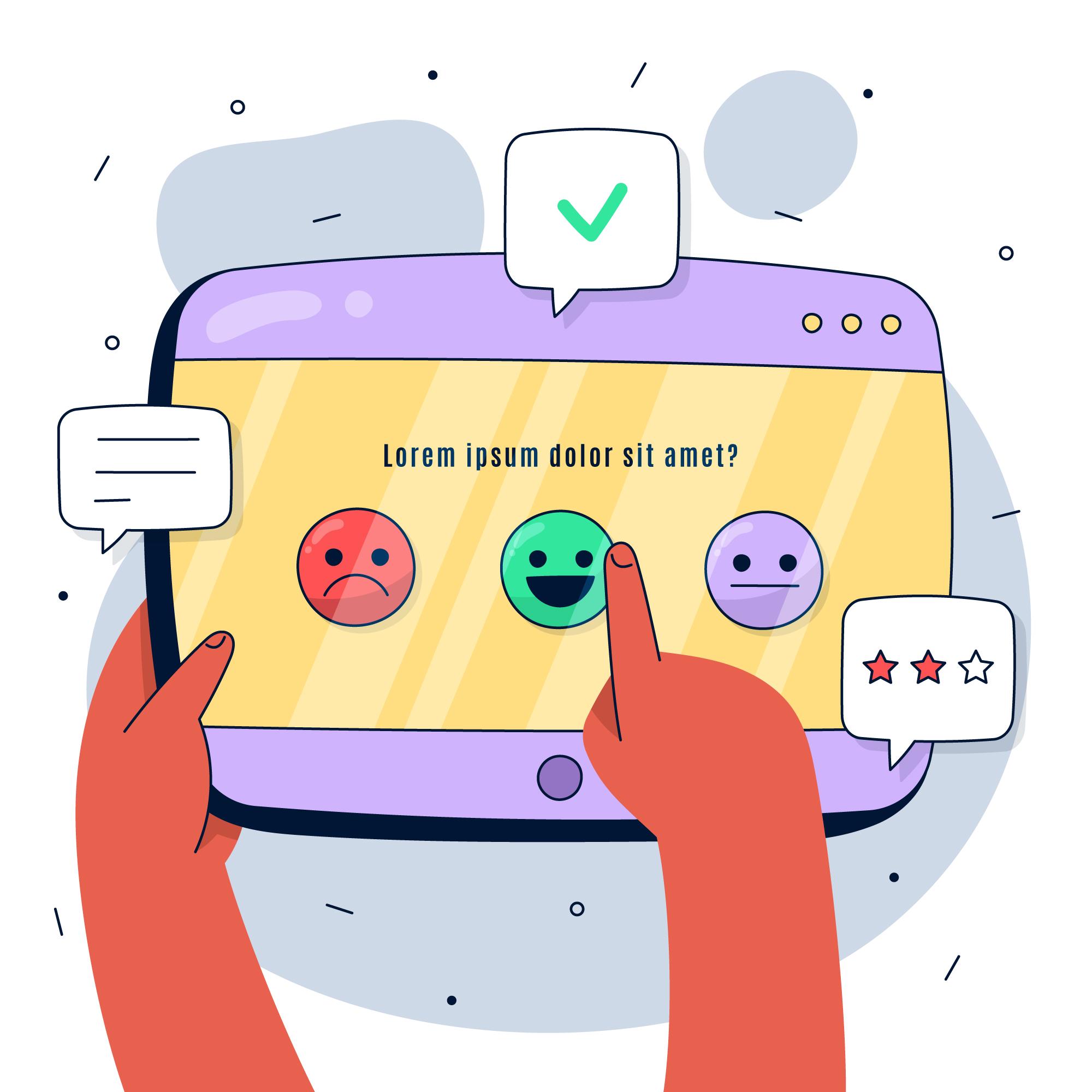
The overall look and feel of a survey can bring you the right stats.
If you’re worried about your online surveys not performing well, it could be the design of your surveys. Perhaps your questions aren’t simple to understand. Or the choices you have offered in the answers are incomplete. Another aspect that slows down the turn-out of your online survey could be the flow, length, theme, colors, or even fonts of the form.
So, this blog post bundles up 13 comprehensive design tips. Now, follow these suggestions and sit back to see your surveys producing better results for you.
13 Design Tips for Successful Online Survey
1. Focused Goal
A goal offers a benchmark for the marketing team and survey designers. So, keep your survey focused on targeting one goal.
For instance, let’s assume your brand offers healthy breakfast options. You can focus your survey on cereals choices or juices you offer. Not both. A focused goal keeps your users not to get distracted or confused.
Also, refine your goal to finer levels. Let’s say you decide to know the flavor of the cereals users prefer. With that, you might also like to introduce them to an upcoming flavor or variant. This is still related to cereals—your focus—and gives you a tiny leeway for marketing without distracting them.
2. Set Survey Duration and Validity
Share with your users how long the shared survey will take in minutes. Information like these helps them to take out enough time and reach the submit button. Otherwise, users might abandon a study while in progress due to a shortage of time.
Similarly, share with them how long a survey is available for responses. No point if a user realized the survey was valid until yesterday when they invested time on it after reaching midway.
3. Avoid Absolute Vocabulary
Words like every, always, never, usually are words showing finality and conclusion. These need binary options like yes or no. But users might not ‘always agree’ or ‘never agree’ (always disagree). Because humans don’t like absolute answers, they need a balance, a midway. Your users are no different, and they may not opt for absolute choices.
Pro tip: Here is a comprehensive post on the latest survey trends.
4. Closed-Ended Questions
Closed-ended questions allow your users to select one of many choices. Such questions reduce the time-taking writing process, which comes with an open-ended question when users overthink and write.
The former type of questions saves much time with predefined possible answers. Such questions are also beneficial in quantitative analysis, easy to respond to, and hold your audience’s attention.
5. Unbiased Questions
Your questions shouldn’t be biased. This can miff your users, and they may abandon the surveys.
For instance, instead of asking, “Strawberry flavor is the most preferred choice among kids. Which one do you like?”, ask, “Which flavor of cereals do your kids prefer?”.
Also, if you notice, the first question is ambiguous because you’re talking about kids’ choices. Then you’re asking parents’ choice. Your respondents will often be parents, adults, and young adults—but surely not kids.
6. Unbiased Answer Choices
Asking, “how well do you like strawberry flavored cereals?” and then popping answers:
- Great
- Good
- Average
offers limited choices to answer. What if a user wants to select ‘don’t like’ or some such? Such narrow and biased surveys will only give you inadequate insights and mar the purpose of your surveys.
7. Push Sensitive Questions Toward End
Consider a survey form as a way to communicate with your audience. And no one likes to be bombarded with age and gender-related questions as an ice-breaker.
Push questions related to demographics toward the end. Start the survey with simple questions about your product like “Do you eat cereals in your breakfast?” and “Which flavor do you like?”. Keep “Which age-group do you belong to?” and “Select a salary range” (if at all you need this) for the end.
8. Avoid Double-Barreled Questions
Focus your question on one topic. A question like “Which flavor in our cereals and juices do you like the most?” can confuse your audience. You might get wrong insights because some users might not be interested in juices at all. Or some of the cereals don’t have the flavors you offer in juices.

9. Incentivize
Offering rewards in some way to your audience garner more insights and loyal respondents. This also shows that you care about your users and value their time and effort.
Opinionest is one such platform where you get paid to take surveys online.
10. Preview Your Survey
Preview what you’re offering to your audience. Multiple times. A slight glitch might turn down many users right before they hit submit. And test on various devices and OS, including mobiles, tablets, laptops, Android and iOS, etc.
Holistic testing and device compatibility are the keys to avoid complaints and ghosting from your audience.
11. Suitable Theme
The theme, including colors, patterns, and fonts, should reflect your goal. If food is your topic, your design aesthetics can be colorful with slightly fancy fonts that should be legible. If employee survey is your purpose, use an appropriate corporate theme with simple fonts, which don’t exude a casual approach.
12. Form Clarity
The clarity in reading should be your approach. Choose fonts that are neither too bold, big, or small. No one likes to pinch the screen to minimize or maximize the size and scroll sidewise or up-down to read—fonts from the Sans-serif family work in almost all designs. Make sure your text pops out well against the backdrop and design.
13. Milestones and Progress Bar
Offer a progress bar to your respondents to know how far are they into the surveys. Telling the number of questions at the start is a good idea. If you’re using multiple screens for dividing the survey into sections, hint your users about this. This helps them to avoid scrolling. A new page is always better than a single lengthy page.

Conclusion
At Opinionest, we take care of generating and distributing surveys for our clients. You get customized survey forms that represent your branding and are easy to use. Should you need help developing surveys to elevate your quantitative and qualitative market research, please reach out to us here.


You may also like
What Happens If You Contradict Yourself in Surveys

Reasons You’ve Been Removed From a Survey Panel & How to Avoid It

How Market Research with the Caregivers Helps the Healthcare Brands

What is Randomization in Market Research and Why it Matters

Copyright © 2026-2027 Track Opinion. all rights reserved.